
Brand Identity & Logo Design Project Overview Love Tooth is a dental practice dedicated to providing a compassionate, stress-free experience for patients. The goal was to move away from the “clinical and cold” medical aesthetic and create a brand that feels approachable, warm, and patient-focused. The Design Concept The core of this identity is a […]
Related Projects
Brand Identity & Logo Design
Project Overview
Love Tooth is a dental practice dedicated to providing a compassionate, stress-free experience for patients. The goal was to move away from the “clinical and cold” medical aesthetic and create a brand that feels approachable, warm, and patient-focused.
The Design Concept
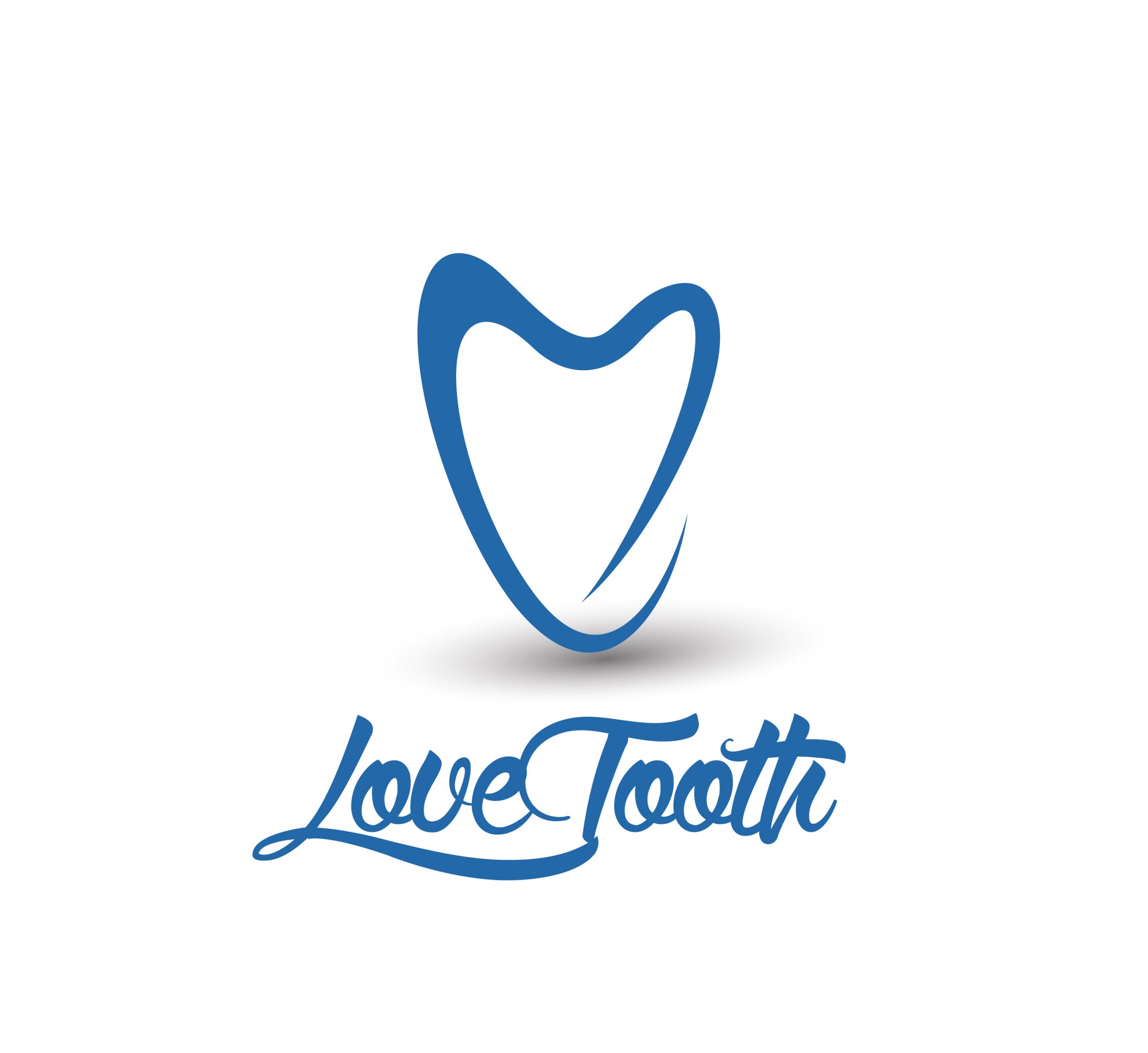
The core of this identity is a clever, minimalist fusion of two powerful symbols: A Tooth and A Heart.
- The Icon: We designed a continuous, flowing line that outlines the shape of a tooth while simultaneously forming a subtle heart shape at the top. This represents the “Love” aspect of the clinic—care, empathy, and professional passion.
- Typography: We utilized a custom script font for “Love Tooth” to give the brand a personal, handwritten feel. The sweeping tail of the ‘L’ and the ‘h’ adds a sense of fluid movement and friendliness.
- Color Strategy: A calming “Ocean Blue” was selected to instill a sense of serenity and professionalism, helping to reduce patient anxiety through color psychology.
The Result
The final logo is a perfect balance between professional clinical care and emotional connection. It communicates that the clinic doesn’t just treat teeth—they care for people. This unique identity helps the practice stand out in a competitive market by immediately building an emotional bond with prospective patients.
Key Highlights:
- Custom Calligraphic Typography
- Minimalist Dual-Meaning Iconography
- Human-Centered Brand Strategy
- Optimized for Signage and Digital Media